Meteorology Today Second Canadian Edition
Earth and Atmospheric Sciences
At its core, weather forecasting is the application of science and technology to predict the state of the atmosphere for a given location and time. It is a complex process that blends physics, advanced mathematics, and massive computational power.
The Scientific Process
The process of creating a forecast generally follows three major phases:
- Observation and Data Collection:Meteorologists gather real-time data from around the globe using a variety of instruments:
- Weather Stations: Measuring surface temperature, humidity, and pressure.
- Radiosondes: Weather balloons that provide vertical profiles of the atmosphere.
- Satellites: Tracking cloud formations, water vapor, and radiation.
- Doppler Radar: Detecting precipitation and wind velocity.
- Numerical Weather Prediction (NWP):This data is fed into supercomputers running mathematical models. these models use fluid dynamics and thermodynamics equations to simulate how the atmosphere will change. A primary challenge here is chaos theory—small errors in initial data can lead to large discrepancies in long-range forecasts.
- Human Analysis:Professional meteorologists interpret the “model output.” They look for specific patterns, such as synoptic-scale systems (large-scale high and low pressure) and local geographical influences, to refine the raw data into a reliable forecast for the public.
Common Forecasting Methods
While modern computers do the heavy lifting, several methods are used to determine outcomes:
- Persistence Method: Assuming the weather tomorrow will be the same as today (useful in stable climates).
- Climatology: Using long-term statistical averages for a specific date.
- Ensemble Forecasting: Running a model multiple times with slightly different starting conditions to see how much the results vary, which helps determine the “confidence” level of a forecast.
Accuracy Limits
Short-range forecasts (1–3 days) are now remarkably accurate, often exceeding 90%. However, because the atmosphere is a nonlinear system, the “predictability limit” generally drops significantly beyond 7 to 10 days.
What is skywatching?
Skywatching (often used interchangeably with stargazing) is the practice of observing celestial objects and events in the sky. While the term usually brings to mind the night sky, it also encompasses daytime phenomena like solar eclipses, atmospheric optics (halos and sundogs), and satellite passes.
Unlike professional astronomy, skywatching is often a recreational pursuit focused on the visual experience and the “hunt” for specific objects.
What to Look For
Skywatchers generally categorize their targets into a few main groups:
- The Moon: The most accessible target. Observing the “terminator” (the line between light and shadow) reveals the most dramatic detail in craters and mountain ranges.
- Planets: Often mistaken for bright stars, planets like Venus, Mars, and Jupiter are easy to spot because they usually glow with a steady light (stars twinkle; planets generally do not).
- Meteor Showers: High-speed debris hitting the atmosphere. These are best viewed with the naked eye rather than a telescope, as you need a wide field of view.
- Deep-Sky Objects: This includes nebulae, star clusters (like the Pleiades), and distant galaxies (like Andromeda).
- Artificial Objects: The International Space Station (ISS) and various satellite “trains” (like Starlink) are common sights around dusk and dawn.
Upcoming Highlights for 2026
Since you are in a prime location for northern skywatching, here are a few key events occurring this year:
| Event | Date (2026) | Notes |
| Lyrid Meteor Shower | April 21–22 | Best viewed in the predawn hours; minimal moon interference this year. |
| Eta Aquarid Shower | May 5–6 | Debris from Halley’s Comet; look for “Earthgrazers” near the horizon. |
| Perseid Meteor Shower | Aug 12–13 | One of the most reliable showers; peaks during a New Moon (ideal darkness). |
| Saturn at Opposition | Oct 4 | Saturn will be at its brightest and visible all night. |
| Geminid Meteor Shower | Dec 13–14 | Often the strongest shower of the year, with up to 75 meteors per hour. |
Tips for Starting Out
- Dark Adaptation: It takes about 20–30 minutes for your eyes to fully adjust to the dark. Avoid looking at your phone or any white light during this time.
- Use Red Light: If you need to see your notes or a map, use a flashlight with a red filter. Red light doesn’t “bleach” your night vision the way white or blue light does.
- The “Averted Vision” Trick: To see faint objects like nebulae, try looking slightly to the side of them. The peripheral part of your retina is more sensitive to low light than the center.
- Weather Check: Transparency (air clarity) and “seeing” (atmospheric stability) are just as important as cloud cover. Cold, crisp nights often provide the best clarity, though they require significant layering.
What is a meteorologist?
A meteorologist is a scientist who studies the atmosphere and its phenomena, including weather patterns, climate trends, and the physical laws that govern them. While often associated with the person presenting the weather on the evening news, the profession is deeply rooted in atmospheric physics, fluid dynamics, and advanced mathematics.
What They Do
A meteorologist’s work generally falls into three primary categories:
- Forecasting (Operational): Using data from satellites, radar, and weather stations to predict future weather. They analyze synoptic-scale patterns—like high and low-pressure systems—to determine how storms will develop and move.
- Research: Investigating the “why” behind weather events. This might include studying the physics of wind, the mechanics of severe thunderstorms, or how the general circulation of the atmosphere is shifting over time.
- Climate Science: Analyzing long-term data to understand patterns over decades or centuries, focusing on how the Earth’s energy balance and atmospheric composition change.
The Education and Skills Required
To work as a professional meteorologist, a strong foundation in the “hard sciences” is essential. The typical pathway includes:
| Category | Key Subjects |
| Education | Usually a Bachelor’s degree in Meteorology or Atmospheric Science (Earth Sciences). |
| Mathematics | Heavy emphasis on calculus and differential equations to model atmospheric motion. |
| Physics | Understanding thermodynamics, radiation, and the kinetics of air and water vapor. |
| Technical Skills | Proficiency in computer programming and Numerical Weather Prediction (NWP) models. |
Specialized Career Paths
Meteorology isn’t a “one-size-fits-all” field. Professionals often specialize in niche areas:
- Synoptic Meteorologists: Focus on large-scale weather systems (like the jet stream or major frontal boundaries).
- Aviation Meteorologists: Provide critical data for flight safety, focusing on turbulence, icing, and wind shear.
- Broadcast Meteorologists: Translate complex scientific data into clear, actionable information for the public.
- Forensic Meteorologists: Investigate past weather events for legal or insurance purposes (e.g., “Was the wind strong enough to cause this structural failure?”).
Tools of the Trade
Modern meteorologists rely on a sophisticated global network of tools:
- Doppler Radar: To “see” precipitation and measure its velocity.
- Geostationary Satellites: To track cloud movement and moisture in real-time.
- Supercomputers: To run massive simulations based on the laws of physics ($F = ma$ applied to air parcels).
Because the atmosphere is a chaotic system, meteorologists are constantly refining these models to improve accuracy, particularly for high-impact events like convective storms or heavy snowfall.
How do you forecast temperature advection by watching the clouds?
Estimating temperature advection—the horizontal transport of heat by the wind—is a classic skill in synoptic meteorology. By observing how wind direction changes with height (using clouds at different altitudes as tracers), you can determine if the atmosphere is warming or cooling.
This technique relies on the thermal wind relationship, which links vertical wind shear to horizontal temperature gradients.
1. Identify Wind Direction at Different Levels
To see advection in action, you need to compare the wind direction near the surface with the wind direction of higher clouds (like altocumulus or cirrus).
- Surface Wind: Observe smoke, flags, or low-level stratus clouds.
- Upper-Level Wind: Watch the movement of mid-to-high-level clouds. It helps to use a stationary object (like a building corner or a power pole) as a reference point to detect slow movement.
2. Apply the “Veering” and “Backing” Rules
The relationship between the change in wind direction and temperature change is consistent in the Northern Hemisphere:
| Wind Pattern | Definition | Advection Type | Result |
| Veering | Wind turns clockwise with height (e.g., South at surface, West aloft). | Warm Air Advection (WAA) | Rising temperatures; often precedes a warm front or storm. |
| Backing | Wind turns counter-clockwise with height (e.g., East at surface, North aloft). | Cold Air Advection (CAA) | Dropping temperatures; often occurs behind a cold front. |
3. Visual Indicators of Vertical Motion
Temperature advection isn’t just about a change in thermometer readings; it dictates the “vertical “stacking” of the atmosphere:
- Warm Air Advection (WAA): Because warm air is less dense, WAA acts like a ramp, forcing air to rise. This typically creates widespread, stratiform (layered) clouds like altostratus or nimbostratus. If you see high cirrus thickening into lower, grey layers while the wind “veers,” warmer weather and steady precipitation are likely approaching.
- Cold Air Advection (CAA): Cold air is denser and tends to sink. However, if cold air moves over a warmer surface, it creates instability. This often results in “clearing” skies or scattered, puffy cumulus clouds (cold air over warm ground causes pockets of air to “bubble” up).
4. The “Cross-Product” Shortcut
A quick mental trick used by forecasters is the 90-degree rule:
- Face into the low-level wind.
- Observe the upper-level wind.
- If the upper wind is coming from your right, it is veering (Warm Advection).
- If the upper wind is coming from your left, it is backing (Cold Advection).
Practical Constraints
This method works best when there is a strong synoptic-scale system nearby. In the peak of summer or in very stagnant high-pressure zones, the winds might be too light or dominated by local terrain (like mountain-valley breezes) to clearly show large-scale advection.
What is weather information?
Weather information is the systematic collection of data points that describe the state of the atmosphere at a specific place and time. It is the “raw material” used by meteorologists and computer models to create the forecasts we rely on every day.
This information is generally divided into two categories: Observed Data (what is happening now) and Modeled Data (what is predicted to happen).
1. The Core Variables
To get a complete picture of the weather, several key physical properties are measured:
- Temperature: The kinetic energy of air molecules, usually measured in Celsius (°C) or Fahrenheit (°F).
- Atmospheric Pressure: The weight of the air column above a point. Rapid changes in pressure are the primary indicators of approaching storm systems.
- Humidity: The amount of water vapor in the air. This is often expressed as Relative Humidity (%) or Dew Point, which is the temperature at which air becomes saturated.
- Wind Velocity: Includes both speed and direction. Wind is the atmosphere’s way of balancing pressure and temperature differences.
- Precipitation: The type (rain, snow, sleet, hail) and amount of water falling to the surface.
- Sky Cover: The fraction of the sky obscured by clouds, usually measured in “oktas” (eighths).
2. Sources of Weather Information
In the modern era, this data is gathered through a sophisticated global network:
| Source | Method | Key Contribution |
| Surface Stations | Automated sensors (ASOS/AWOS) | Precise ground-level conditions at airports and cities. |
| Weather Radar | Microwave pulses | Detecting the intensity and movement of precipitation. |
| Satellites | Infrared and Visible imaging | Tracking large-scale cloud patterns and moisture in the upper atmosphere. |
| Radiosondes | Sensors attached to balloons | Providing a vertical “slice” of the atmosphere’s temperature and wind. |
| Buoys & Ships | Marine sensors | Critical data from the oceans, where most weather systems form. |
3. How Information is Disseminated
Once collected, weather information is formatted for different audiences:
- METARs & TAFs: Highly encoded text reports used primarily by pilots and aviation specialists for flight planning.
- Synoptic Charts: Maps showing “isobars” (lines of equal pressure), fronts, and high/low-pressure centers.
- Public Forecasts: Simplified summaries (e.g., “70% chance of rain”) designed for daily decision-making.
- GRIB Files: Gridded binary data used by scientists and developers to feed weather information into websites, apps, or navigation software.
4. Why Accuracy Matters
Beyond just knowing if you need an umbrella, weather information is a critical economic and safety driver. It allows for:
- Aviation Safety: Calculating fuel loads and avoiding turbulence.
- Agricultural Planning: Determining optimal planting and harvesting times based on soil moisture and frost risk.
- Energy Management: Predicting heating and cooling demands for the power grid.
- Emergency Management: Issuing warnings for severe thunderstorms, tornadoes, or floods.
What is data collection?
Data collection is the systematic process of gathering observations, measurements, or information to answer specific questions, test hypotheses, or evaluate outcomes. It is the bridge between a theoretical idea and a factual conclusion.
In scientific and technical fields, data collection must be standardized—meaning it is done the same way every time—to ensure the results are reliable and can be compared over time.
1. Types of Data
Before collecting data, you must determine what “flavor” of information you need:
- Quantitative Data: Expressed in numbers and totals (e.g., “The wind speed is 25 km/h,” or “The server had 99.9% uptime”). This is used for statistical analysis.
- Qualitative Data: Descriptive and conceptual (e.g., “The clouds appear fibrous and wispy,” or “User feedback indicates the interface is ‘intuitive’”). This is used to understand meanings and qualities.
2. Common Collection Methods
The method chosen depends on the “domain” or field of study:
| Method | Best For… | Example |
| Direct Observation | Natural phenomena or behavior | Recording the timing of a solar eclipse or cloud movement. |
| Instrumentation | Precise physical measurements | Using a barometer to log atmospheric pressure changes. |
| Surveys/Questionnaires | Human opinions and trends | Gathering user feedback on a new website feature. |
| Experiments | Testing cause and effect | Measuring how different CPU clock speeds affect heat output. |
| Archival Research | Historical trends | Pulling past climate records to study long-term warming. |
3. The Data Collection Cycle
Effective data collection follows a logical loop to ensure the “signal” is stronger than the “noise”:
- Goal Setting: Define exactly what you need to know (e.g., “How does humidity affect AdSense click-through rates?”).
- Tool Selection: Choose the right instrument (a physical sensor, a digital log, or a human-led survey).
- Sampling: Decide where and when to collect data. You can’t measure everything everywhere, so you choose a representative “sample.”
- Cleaning & Validation: Removing “junk” data (like a sensor error that records a temperature of 500°C) before analysis.
4. Digital & Automated Collection
In fields like IT and meteorology, data collection is often automated through:
- APIs: Software “talking” to software to pull real-time stats (like weather data from a central server).
- Web Scraping: Programmatically extracting information from websites.
- Log Files: Servers automatically recording every “event” that happens, which can later be audited for patterns.
Why it Matters
Without rigorous data collection, conclusions are just guesses. Whether you are troubleshooting a network, forecasting a storm, or optimizing a website’s performance, your success depends entirely on the quality of the data you started with.
How are forecasts produced?
The production of a modern weather forecast is a massive, multi-stage operation that moves from global observations to complex mathematical simulations, and finally to human interpretation. It is often described as a “chain” where the strength of the final forecast depends on the quality of every link.
Phase 1: Data Acquisition (The Starting Point)
Before a computer can predict the future, it must perfectly understand the present. This is called Initialization. Every few hours, a global “snapshot” of the atmosphere is taken using:
- Surface Observations: Thousands of automated stations (like those at YYC airport) reporting pressure, temperature, and wind.
- Vertical Profiling: Weather balloons (radiosondes) launched twice daily worldwide to measure the “stack” of the atmosphere.
- Remote Sensing: Satellites measuring infrared radiation and water vapor, and Doppler radar tracking precipitation movement.
Phase 2: Numerical Weather Prediction (The Engine)
This is the “heavy lifting” phase. The gathered data is fed into supercomputers running Numerical Weather Prediction (NWP) models.
- The Grid: The atmosphere is divided into a three-dimensional grid of boxes. The computer calculates the change in weather variables for every single box.
- The Physics: The models use fundamental equations, such as Navier-Stokes equations for fluid motion and the Laws of Thermodynamics, to simulate how air parcels will move and interact.
- Common Models: You may recognize names like the HRRR (High-Resolution Rapid Refresh) for short-term storm tracking or the ECMWF and GFS for long-range global trends.
Phase 3: Ensemble Forecasting (Managing Chaos)
Because the atmosphere is a chaotic system, a tiny error in the initial data can lead to a completely wrong forecast five days later. To combat this, meteorologists use Ensembles:
- They run the same model 20 to 50 times.
- Each run has “tweaked” initial conditions (slightly different temperatures or wind speeds).
- If all the runs agree, confidence is high. If the runs vary wildly (the “spaghetti plot” effect), the forecast is considered uncertain.
Phase 4: Human Interpretation and Post-Processing
Raw computer data is rarely perfect. It often has “biases”—for example, a model might consistently predict temperatures that are 2°C too cold for a specific valley.
- MOS (Model Output Statistics): A statistical process that corrects model data based on historical performance at a specific location.
- The Meteorologist’s Role: A professional forecaster looks at multiple models and applies local knowledge. They might realize a model isn’t handling a “Chinook” event correctly or that a cold front is moving faster than the computer predicted.
Phase 5: Communication
The final step is translating the technical data into products people can use:
- Visualizations: Maps showing pressure systems (H and L) and frontal boundaries.
- Probabilities: Converting ensemble data into a “percent chance of precipitation.”
- Alerts: Issuing watches and warnings when the data suggests a threat to life or property.
The Evolution of Accuracy
| Forecast Range | Accuracy Level | Primary Driver |
| 0–12 Hours | Very High | Radar and Satellite (Nowcasting) |
| 1–3 Days | High | High-resolution regional models |
| 4–7 Days | Moderate | Global ensemble models |
| 8–14 Days | Low | Climatology and large-scale oscillations |
How are forecasts distributed?
The distribution of weather forecasts is the final, critical step in the meteorological value chain. It transforms complex mathematical data from supercomputers into actionable information for the public, government agencies, and private industries.
This process relies on a massive, interconnected network of communication protocols designed to ensure that even in a total power failure or “black swan” event, life-saving information can still get through.
1. The Global Data Backbone (GTS)
Before a forecast reaches your phone, it travels through the Global Telecommunication System (GTS). Managed by the World Meteorological Organization (WMO), this is a dedicated, high-speed network that allows countries to exchange weather data in real-time.
- Standardization: Data is sent in highly compressed, universal formats like BUFR (Binary Universal Form for the Representation of meteorological data) or GRIB (Gridded Binary).
- Redundancy: The GTS is designed to be “always on,” ensuring that a storm moving from the Pacific into British Columbia is tracked seamlessly by both Canadian and American systems.
2. Public Distribution Channels
For the general public, forecasts are distributed through a “multi-modal” approach to reach as many people as possible:
- Mobile Apps & APIs: Most weather apps (like WeatherCAN or The Weather Network) pull data from government servers via Application Programming Interfaces (APIs). This allows for hyper-local, “nowcast” updates based on your GPS coordinates.
- Emergency Alert Systems: In Canada, the National Public Alerting System (NAAD) can override television, radio broadcasts, and LTE cellular networks to push “Alert Ready” notifications directly to your device during life-threatening events like tornadoes.
- Weather Radio: Using the VHF band (typically around 162 MHz), dedicated weather radio stations broadcast continuous cycles of forecasts and observations. Because these operate on a different frequency than standard FM/AM, they are often the only source of info during major grid outages.
3. Specialized Distribution for Industry
Many sectors require more detail than a simple “partly cloudy” icon. They receive specialized data “feeds”:
| Industry | Distribution Method | Key Product |
| Aviation | AFTN (Aeronautical Fixed Telecom Network) | TAFs (Terminal Aerodrome Forecasts) and SIGMETs for turbulence. |
| Marine | NAVTEX & Satellite (Inmarsat) | High-seas forecasts and gale warnings for ships at sea. |
| Energy | Direct API Data Streams | Wind speed and solar irradiance forecasts for power grid balancing. |
| Agriculture | Specialized Portals | Soil moisture maps and 14-day “growing degree day” outlooks. |
4. The Digital Formatting Standards
To make forecasts readable by computers and humans alike, they are often distributed in specific technical formats:
- CAP (Common Alerting Protocol): A digital format that allows a single emergency alert to be simultaneously triggered across sirens, websites, and cell phones.
- GeoJSON / KML: Used for mapping software (like Google Earth or GIS systems) to overlay radar and storm tracks on top of geographic maps.
- Synthesized Voice: Automated systems convert text-based forecasts into audio for phone-in weather lines and radio broadcasts.
The “Last Mile” Challenge
The most difficult part of forecast distribution is the “Last Mile”—ensuring the information is actually understood by the person receiving it. This is why meteorologists focus on “Impact-Based Forecasting,” moving away from just saying “50 mm of rain” to saying “50 mm of rain likely to cause flooding on Highway 1.”
What are forecasting tools?
Forecasting tools are the specific instruments, software, and mathematical frameworks used to measure the current atmosphere and calculate its future state. In modern meteorology, these tools range from physical hardware in the field to massive “virtual” simulations running on supercomputers.
They are generally categorized by how they gather or process weather information.
1. Observational Hardware (The “Sensors”)
Before a forecast can be made, tools must collect “ground truth” data.
- Automated Surface Observing Systems (ASOS): These are the standard sensor arrays found at airports. They measure temperature, dew point, wind speed/direction, visibility, and sea-level pressure.
- Radiosondes: Small instrument packages carried by weather balloons. They are the primary tool for capturing a vertical profile (a “sounding”) of the atmosphere’s pressure, temperature, and humidity up to 30 km.
- Doppler Radar: A tool that sends out microwave pulses to detect precipitation. It measures the “reflectivity” (intensity of rain/snow) and the “velocity” (speed of the wind moving toward or away from the radar).
- Weather Satellites: Tools like GOES (Geostationary) or POES (Polar-orbiting) that use visible and infrared sensors to track cloud patterns, water vapor, and lightning from space.
2. Numerical Models (The “Software”)
Once data is collected, it is fed into Numerical Weather Prediction (NWP) models. These are the most powerful tools in a forecaster’s arsenal.
| Tool Name | Type | Best Used For… |
| GFS (Global Forecast System) | Global | Long-range outlooks (up to 16 days) across the entire planet. |
| ECMWF (European Model) | Global | Often considered the most accurate for medium-range (3–10 days) global patterns. |
| HRRR (High-Resolution Rapid Refresh) | Regional | Short-term “nowcasting” of severe storms and local wind shifts. |
| NAM (North American Mesoscale) | Regional | Detailed tracking of fronts and precipitation over North America. |
3. Diagnostic & Analysis Tools
Meteorologists use specific software to visualize and interpret the mountain of data produced by models:
- AWIPS (Advanced Weather Interactive Processing System): A powerful workstation software that integrates satellite, radar, and model data into a single interface for forecasters.
- Thermodynamic Diagrams (Skew-T Log-P): A specialized charting tool used to plot vertical soundings. It allows a forecaster to “see” atmospheric stability and predict the likelihood of thunderstorms or freezing rain.
- Ensemble “Spaghetti” Plots: A visualization tool that shows multiple model runs at once. If the lines (representing different scenarios) stay close together, the tool indicates high confidence in the forecast.
4. Statistical & Post-Processing Tools
Because raw model data can have “biases” (like always being slightly too warm in a specific valley), secondary tools are used to refine the numbers:
- MOS (Model Output Statistics): A tool that uses historical data to “correct” a model’s raw output for a specific location.
- Climate Reanalysis Tools: These allow researchers to look back at decades of collected data to identify long-term trends and “teleconnections” (like how El Niño affects winter patterns in the Rockies).
The “Human” Tool
Despite the high-tech hardware, the meteorologist’s brain remains a vital tool. Humans are uniquely capable of “pattern recognition”—identifying when a computer model is failing to handle a complex local phenomenon, like a terrain-driven wind or a sudden temperature inversion.
What is the thickness chart as a forecasting tool?
In synoptic meteorology, a thickness chart is a powerful diagnostic tool used to measure the average temperature of a layer of the atmosphere. Instead of measuring temperature directly with a thermometer, it measures the vertical distance (the “thickness”) between two constant pressure surfaces.
The physics behind this tool is rooted in the Hypsometric Equation, which states that the thickness of an atmospheric layer is directly proportional to its mean virtual temperature. Put simply: Warm air expands (thicker layer), and cold air contracts (thinner layer).
1. The Standard 540-Dam Line
The most common thickness chart used by forecasters is the 1000–500 hPa (mb) thickness. This measures the distance between the near-surface (1000 hPa) and the middle of the troposphere (500 hPa).
- The “Rain-Snow Line”: In many regions, the 540 decameter (5400 meter) line is used as a first-guess indicator for the transition between rain and snow.
- Below 540 dam: The air is generally cold enough for snow.
- Above 540 dam: The air is usually warm enough for rain.
- Correction for Elevation: In higher elevation areas, like the Canadian Prairies or the Rockies, the 540 line must be adjusted downward (often to 528 or 522 dam) because the “column” starts much higher up.
2. Identifying Fronts and Air Masses
Thickness charts are essential for locating frontal boundaries that might be “masked” at the surface by local terrain or nighttime cooling.
- Frontal Zones: Fronts appear on thickness charts as areas where the thickness lines (isohypses) are packed closely together. This indicates a “tight” temperature gradient—the hallmark of a strong cold or warm front.
- Advection Patterns: When thickness lines cross atmospheric pressure lines (isobars) at a sharp angle, it indicates strong Temperature Advection.
- If the wind blows from higher thickness (warm) to lower thickness (cold), you have Warm Air Advection (WAA).
3. Thermal Ridges and Troughs
Just like surface pressure maps have Highs and Lows, thickness charts have ridges and troughs:
- Thermal Ridge: An upward “bulge” of high thickness values. This represents a tongue of warm air pushing poleward.
- Thermal Trough: A downward “dip” of low thickness values. This represents cold polar air plunging toward the equator.
Forecasters look for Thermal Ridges because they often align with fair weather and rising temperatures, while Thermal Troughs are associated with instability and cold surges.
4. Forecasting Storm Intensity
Thickness charts help meteorologists determine if a storm system is “vertically stacked” or if it is still developing.
- Baroclinic Instability: If the center of a surface Low-pressure system is located directly “downstream” (to the east) of a thickness trough, the system is likely to intensify.
- The 500 hPa Connection: By comparing thickness to the 500 hPa height map, forecasters can calculate the Thermal Wind, which tells them how the jet stream will steer the storm.
Summary Table: Thickness Values and Weather
| Thickness (1000-500 hPa) | Typical Interpretation |
| < 510 dam | Extreme arctic air; high risk of record cold. |
| 540 dam | Traditional “Rain-Snow” transition line at sea level. |
| > 570 dam | Tropical air mass; associated with heatwaves or humid conditions. |
What are forecasting methods?
Forecasting methods are the different logical approaches meteorologists use to predict the future state of the atmosphere. While modern supercomputers do most of the heavy lifting, professional forecasters still use a variety of “human-led” and statistical methods to refine those predictions and handle specific local weather scenarios.
1. Persistence Method
The simplest form of forecasting. It assumes that the conditions at the time of the forecast will not change.
- How it works: If it is 22°C and sunny today, you predict it will be 22°C and sunny tomorrow.
- When it’s used: This is remarkably effective in stable, stagnant weather patterns (like the desert in summer) or for very short-term “nowcasts” (the next 20 minutes). It fails completely when a front or storm system is approaching.
2. Climatology Method
This method relies on the long-term average weather statistics for a specific date and location.
- How it works: If the historical average high for Calgary on March 23 is 4°C, you forecast 4°C.
- When it’s used: It is a good “baseline” for long-range planning (e.g., “What will the weather be for a wedding six months from now?”). It is often more accurate than a computer model once you look beyond 15 days.
3. Trends Method (Steady-State)
This involves calculating the speed and direction of features like fronts, high-pressure centers, or clusters of clouds and mathematically “extrapolating” their future position.
- How it works: If a cold front is 400 km west of your location and moving east at 40 km/h, you forecast that it will arrive in 10 hours.
- When it’s used: Extremely useful for short-term timing of rain or snow, though it assumes the system won’t speed up, slow down, or intensify.
This is based on the idea that “history repeats itself.” Meteorologists look for a past weather map that closely resembles the current one.
4. Analog Method
- How it works: A forecaster might say, “This setup looks exactly like the storm of March 1998,” and then predict a similar outcome.
- When it’s used: It is very difficult to find a perfect match (an “analog”), but this method is helpful for identifying rare, high-impact events like major blizzards or flood setups.
5. Numerical Weather Prediction (NWP)
This is the modern standard. It uses massive supercomputers to solve complex physics equations (fluid dynamics and thermodynamics).
- How it works: The atmosphere is divided into a 3D grid, and the computer calculates how air moves from one “box” to the next based on pressure and temperature.
- When it’s used: For almost all forecasts from 12 hours to 10 days out.
6. Ensemble Forecasting
Because the atmosphere is chaotic, a tiny error in the initial data can ruin a forecast. Ensembles are designed to measure this uncertainty.
- How it works: Instead of running a model once, the computer runs it 20–50 times, each with slightly “tweaked” starting conditions.
- When it’s used: To determine the “confidence” of a forecast. If 90% of the runs show snow, the forecaster has high confidence. If the runs are scattered, the forecast is considered “low confidence.”
Comparison of Methods
| Method | Strengths | Weaknesses |
| Persistence | Best for very short-term (minutes). | Fails during weather changes. |
| Climatology | Reliable for long-range planning. | Cannot predict specific storms. |
| Trend | Great for timing front arrivals. | Systems often change speed/intensity. |
| NWP/Model | High accuracy for days 1–5. | Computationally expensive; chaotic. |
| Ensemble | Quantifies risk and uncertainty. | Can be difficult to interpret for the public. |
What is numerical weather prediction?
Numerical Weather Prediction (NWP) is the process of using mathematical models of the atmosphere and oceans to predict the weather based on current conditions. It is the engine behind almost every modern weather app and television forecast.
Unlike early forecasting, which relied on looking at past patterns (climatology) or human intuition, NWP treats the atmosphere as a fluid that obeys the laws of physics.
1. The Core Concept: The 3D Grid
Because the atmosphere is a continuous gas, computers cannot calculate every molecule’s movement. Instead, NWP models divide the atmosphere into a three-dimensional grid of boxes.
- Horizontal Resolution: The size of the boxes (e.g., 10 km x 10 km). Smaller boxes provide higher “resolution” but require more computing power.
- Vertical Layers: The grid extends from the Earth’s surface to the top of the atmosphere, often with 50 to 100 different levels to capture changes in the jet stream and cloud formations.
2. The Governing Equations
NWP models work by solving a set of complex equations for every single box in that grid. These are known as the Primitive Equations, and they include:
- Conservation of Momentum: Based on Newton’s Second Law ($F = ma$), describing how wind moves.
- Conservation of Mass (Continuity Equation): Ensuring that air “disappearing” from one box appears in another.
- Conservation of Energy: The First Law of Thermodynamics, tracking how air heats and cools.
- Ideal Gas Law: Relating pressure, temperature, and density.
- Conservation of Water: Tracking moisture as it changes from vapor to liquid (rain) or solid (snow).
Because these equations are “nonlinear,” they cannot be solved with simple algebra. Computers use numerical methods to approximate the answers step-by-step into the future (e.g., calculating the state of the atmosphere every 10 minutes).
3. The NWP Workflow
The “run” of a model follows a strict cycle:
- Data Assimilation: The model is “initialized” with real-world data from satellites, weather balloons, and ground stations. This creates the “starting line” for the simulation.
- Integration: The supercomputer solves the equations for the next time step (e.g., $+15$ minutes), then uses that result to calculate the next $+15$ minutes, and so on, until it reaches the end of the forecast period (e.g., 10 days).
- Parameterization: Some processes, like the formation of a single snowflake or a small turbulent eddy, are too small for the grid to “see.” The model uses simplified formulas (parameterizations) to estimate the effects of these small-scale events on the larger grid.
4. Major Models in Use Today
Different organizations run their own versions of these “virtual Earths,” each with slightly different math and resolutions:
| Model | Origin | Strength |
| ECMWF (Euro) | Europe | Widely considered the most accurate for medium-range (3–10 day) global forecasts. |
| GFS | USA (NOAA) | A reliable global model that provides free data to the entire world. |
| GEM (Global/Regional) | Canada (ECCC) | Optimized for Northern Hemisphere and Arctic conditions. |
| HRRR | USA | A “high-resolution” model that updates every hour, specifically for tracking thunderstorms and local wind shifts. |
Why aren’t they perfect?
NWP faces the “Chaos Problem.” Because the equations are so sensitive, a tiny error in the initial data (like a sensor being off by 0.1°C in the middle of the ocean) can grow into a massive error in the forecast 7 days later. This is why meteorologists use Ensemble Forecasting—running the model dozens of times with tiny variations to see where the outcomes diverge.
What is the forecast funnel?
The Forecast Funnel is a conceptual framework used by meteorologists to systematically analyze the atmosphere by starting with the “big picture” and narrowing down to local details.
Developed by legendary meteorologist Len Snellman, it is designed to prevent “tunnel vision”—where a forecaster might get distracted by small, local details before understanding the massive atmospheric drivers that dictate the overall weather pattern.
The Stages of the Funnel
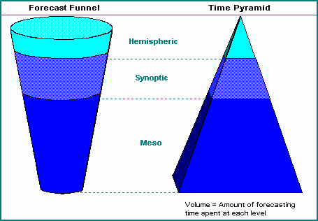
The process moves from the largest spatial and temporal scales to the smallest:
- Hemispheric/Planetary Scale: * Focus: The entire globe or hemisphere.
- Action: Identifying the long-wave patterns (Rossby waves) and the position of the jet stream. This tells the forecaster if the general regime is “blocked,” “zonal” (fast-moving), or “meridional” (highly wavy).
- Synoptic Scale: * Focus: Continental or national (thousands of kilometers).
- Action: Locating high and low-pressure centers, air masses, and frontal boundaries. This is where you identify the “problem of the day,” such as a major cyclone moving across the Prairies.
- Mesoscale: * Focus: Regional or city-sized (tens to hundreds of kilometers).
- Action: Analyzing local triggers like terrain effects (mountains), lake breezes, or “outflow boundaries” from previous storms. This is the scale where specific storm cells or localized wind events (like Chinooks) are forecasted.
- Microscale: * Focus: Very local (meters to a few kilometers).
- Action: Predicting exact timing and intensity for a specific location, such as “Will it rain at the airport at 4:00 PM?” or “What is the peak gust in this specific valley?”
Why Use the Funnel?
The funnel acts as a logical filter. If the hemispheric scale shows a massive ridge of high pressure over your region, you know that even if the local data suggests a chance of rain, the large-scale “lid” on the atmosphere will likely prevent any significant storms from forming.
| Scale | Map/Tool Used | Key Question |
| Hemispheric | 500 hPa Height Maps | Is the jet stream pattern favorable for storms? |
| Synoptic | Surface Analysis / Thickness Charts | Where are the fronts and pressure centers? |
| Mesoscale | Doppler Radar / High-Res Models | Where is the specific lifting mechanism (trigger)? |
| Microscale | Local Sensors / Skywatching | What is happening right now at my exact spot? |
The “Inverted Funnel” Debate
With the rise of high-powered Numerical Weather Prediction (NWP), some modern meteorologists argue for “inverting” the funnel. Since computers are now excellent at the large-scale math, humans can add the most value by starting at the bottom (local scale) to fix the small errors the computer models often miss.
Would you like to try applying the funnel approach to today’s weather by starting with a look at the 500 hPa jet stream map for North America?
How to Forecast Weather – Learn the Key Concepts and Strategies
This video provides a clear educational overview of how the forecast funnel works in practice, moving from continental maps down to local precise locations.
What are some forecast problems how can they be solved?
Weather forecasting is an exercise in managing uncertainty. Even with supercomputers, the atmosphere’s chaotic nature creates specific “bottlenecks.” Forecasters solve these by using a combination of high-tech cross-referencing and human intuition.
1. The “Butterfly Effect” (Initial Condition Errors)
The Problem: Because the atmosphere is a nonlinear system, a tiny error in today’s data (like a missing temperature report from the middle of the Pacific) can grow into a massive forecast “bust” a week later.
- The Solution (Ensembles): Instead of trusting one single model run, forecasters use Ensemble Modeling. They run the model 20–50 times, each with a slightly “tweaked” starting point. If the runs stay together, they have high confidence; if they diverge into a “spaghetti plot,” the forecaster knows to communicate lower certainty.
2. “Model Bias” (Persistent Errors)
The Problem: Every computer model has a “personality.” For example, the American GFS model might consistently predict temperatures that are $2^\circ\text{C}$ too warm in the valleys of the Rockies, while the European ECMWF might be too aggressive with snowfall.
- The Solution (MOS & Human Oversight): Forecasters use Model Output Statistics (MOS), which is a statistical tool that “corrects” the raw computer data based on historical performance at that exact spot. An experienced meteorologist will also “weight” different models based on which one is handling the current weather pattern better.
3. “Ground Clutter” and False Returns
The Problem: Doppler radar can be “tricked.” It often detects swarms of insects, flocks of birds, or even nearby hills (ground clutter) and displays them as if they were rain or snow.
- The Solution (Dual-Polarization Radar): Modern radar sends out both horizontal and vertical pulses (Dual-Pol). By comparing how the pulses bounce back, the radar can distinguish between “round” raindrops and “irregular” objects like birds or jagged hail. Forecasters also check Velocity data; if the “echo” isn’t moving with the wind, they know it’s not a storm.
4. Small-Scale “Pop-Up” Storms
The Problem: Large-scale global models are great at predicting massive cold fronts but struggle with “air-mass thunderstorms”—those small, intense storms that pop up on a hot afternoon and only hit one neighborhood.
- The Solution (High-Resolution Models & Satellites): Forecasters switch to Meso-scale models (like the HRRR) that have much smaller “grid boxes” (3 km instead of 10–20 km). They also monitor Geostationary Satellites in real-time, looking for “towering cumulus” clouds that indicate a storm is starting to “bubble up” before it even shows up on radar.
5. The “Rain-Snow” Line (The 540-Dam Problem)
The Problem: In winter, a difference of just $1^\circ\text{C}$ determines whether a city gets a slushy rain or 20 cm of heavy snow. Computer models often struggle with the exact “transition zone.”
- The Solution (Thickness Charts & Soundings): Forecasters look at Thickness Charts to see how deep the cold air is. They also use Radiosonde Soundings (weather balloons) to see if there is a “warm nose” of air a few thousand feet up that could melt snow into freezing rain before it hits the ground.
Summary Table: Problem vs. Tool
| Forecasting Challenge | The Tool Used to Solve It |
| Data Gaps (Oceans/Poles) | Polar-orbiting & Geostationary Satellites |
| Atmospheric Chaos | Ensemble “Spaghetti” Plots |
| Model Inaccuracies | MOS (Model Output Statistics) & Bias Correction |
| Thunderstorm Triggers | High-Resolution Meso-models (HRRR) |
| Precipitation Type | Skew-T Soundings & Thickness Charts |
What are other forecasting methods?
Beyond the standard numerical and historical methods, meteorologists use several specialized techniques to handle specific timeframes or rare, high-impact events. These methods often bridge the gap between “raw data” and “human experience.”
1. Nowcasting (0–6 Hours)
Nowcasting isn’t just a short-term forecast; it is a distinct method that relies almost entirely on remote sensing (radar and satellite) rather than computer models.
- How it works: Forecasters use “extrapolation.” If a severe thunderstorm cell is moving at 50 km/h toward the northeast, they project its path for the next hour.
- The Tool: Doppler Radar is the primary tool here. By looking at “Reflectivity” (intensity) and “Velocity” (wind), they can issue warnings for a specific neighborhood before the storm arrives.
2. Isentropic Analysis
While most weather maps look at “constant pressure” (like the 500 hPa map), isentropic analysis looks at constant potential temperature (entropy) surfaces.
- How it works: Air tends to move along these “slanted” surfaces rather than flat horizontal planes.
- Why it’s used: It is one of the best ways to visualize Warm Air Advection (WAA) and “isentropic lift.” It helps forecasters see where moisture is being pushed “up the slope” of a warm front, which often results in steady, widespread snow or rain well before the front actually arrives at the surface.
3. Teleconnections (Long-Range/Seasonal)
This method looks at how weather in one part of the world influences weather thousands of miles away.
- How it works: Meteorologists track “oscillations”—large-scale swings in atmospheric pressure and ocean temperatures.
- Key Examples: * ENSO (El Niño Southern Oscillation): A warm El Niño often leads to milder winters in Western Canada.
- Arctic Oscillation (AO): When the “Polar Vortex” is strong (positive phase), cold air stays bottled up in the north. When it weakens (negative phase), that cold air spills south into the Prairies.
4. Machine Learning and AI Forecasting
This is the newest “frontier” in the field. Rather than solving physics equations (like NWP), AI models are trained on decades of past weather data.
- How it works: The AI learns the “patterns” that lead to specific outcomes. For example, it might learn that whenever a certain pressure setup occurs over the Pacific, Calgary gets a heavy upslope snow event 48 hours later.
- The Benefit: AI models like GraphCast or Pangu-Weather can produce a 10-day global forecast in seconds on a single desktop computer, whereas traditional NWP models require hours on a massive supercomputer.
5. Probability of Precipitation (PoP)
This is a statistical method used to communicate risk to the public. It is calculated using the formula:
PoP = C * A
- C = The confidence that precipitation will occur somewhere in the forecast area.
- A = The percentage of the area that will receive measurable precipitation (>0.2 mm).
- Example: If a forecaster is 50% sure that a storm will hit exactly 80% of the city, the PoP is 40%.
Summary of Advanced Methods
| Method | Primary Goal | Best For… |
| Nowcasting | Instant accuracy | Severe thunderstorms and tornadoes. |
| Isentropic Analysis | Vertical motion | Predicting the “start time” of snow/rain. |
| Teleconnections | Seasonal trends | Predicting a “mild winter” vs. a “harsh winter.” |
| AI / Machine Learning | Speed and Pattern Recognition | Rapid global medium-range forecasting. |
What are TV weathercasters and how does that map get on the television screen?
A TV weathercaster (often called a weather presenter) is the on-air personality who delivers the forecast to the audience. While many modern weathercasters are also fully degreed meteorologists, some are broadcast journalists who specialize in communicating data prepared by others.
The “magic” of how that map appears behind them involves a blend of physics, specialized software, and a bit of clever stagecraft.
1. The Green Screen (Chroma Key)
The most important tool in the studio is the green screen.
- How it works: The weathercaster stands in front of a solid green wall. In the control room, a computer uses a process called Chroma Keying. The software is told to “look” for that specific shade of green and replace it instantly with a different video source—in this case, the weather graphics.
- Why Green? This specific shade (“Chroma Key Green”) is used because it doesn’t exist in human skin tones and is rarely found in clothing.
- The “Invisible” Problem: If a weathercaster wears a green tie or dress, the computer will replace that clothing with the weather map, making the person appear to have a hole in their chest or a transparent head!
2. How They Know Where to Point
Since the weathercaster is looking at a blank green wall, they can’t actually see the map they are pointing to. They use two tricks to navigate:
- Confidence Monitors: Large TV screens are placed just off-camera to the left and right. The weathercaster subtly “peeks” at these monitors to see the combined image (themselves standing on the map).
- Peripheral Vision and Practice: Experienced presenters memorize the layout of their maps. They use their peripheral vision to “anchor” their hands to specific geographic landmarks, like the Great Lakes or the Rocky Mountains.
3. The Graphics Engine
The maps themselves are produced by specialized “render engines” (like Max or Baron) that sit in the station’s server room.
- Data Ingest: The computer pulls raw data from the National Weather Service or Environment Canada (radar, satellite, and model data).
- Visualization: The software converts this data into the colorful, moving maps you see. For example, it takes raw radar “reflectivity” numbers and colors them green for rain or pink for hail.
- The “Clicker”: The weathercaster holds a small remote control (usually hidden in their hand). Each click triggers the next “slide” or animation in their presentation, allowing them to time their speech perfectly with the graphics.
4. Evolution of the Map
| Era | Technology | Method |
| 1950s | Plexiglass & Markers | Drawing Highs and Lows by hand over a paper map. |
| 1970s | Magnetic Boards | Sticking “Sun” and “Cloud” magnets onto a metal board. |
| 1980s+ | Digital Chroma Key | The transition to the computer-generated green screen we use today. |
| Current | Augmented Reality (AR) | Graphics that appear to “float” in 3D space around the presenter. |
Why “Meteorologist” vs. “Weathercaster”?
While the terms are used interchangeably, there is a technical difference:
- Meteorologist: Typically holds a Bachelor of Science degree in Atmospheric Science or Meteorology. They often perform their own data analysis and “build” the forecast from scratch.
- Weathercaster: May have a degree in Communications or Journalism. They are skilled at delivering the information clearly but may rely on a staff meteorologist or a private weather service for the actual prediction.
Would you like to see a video of how a modern weather studio is set up behind the scenes?
Behind the scenes of a TV weather studio
This video features a meteorologist demonstrating exactly how the chroma key green screen works and how they use monitors to see where they are pointing.
What are worded forecasts?
A worded forecast (or “textual forecast”) is the translation of complex meteorological data into plain-language sentences that the general public can understand.
While meteorologists work with “coded” data (like METARs for pilots or GRIB files for computers), they must produce a worded version to answer the most common questions: What is the sky like? Will it rain? How cold will it be?
1. The Structure of a Worded Forecast
In Canada and the U.S., worded forecasts follow a strict, standardized hierarchy to ensure the most important information is read first. A typical entry for a single day usually includes:
- Period Label: (e.g., “Today,” “Tonight,” or “Wednesday”)
- Sky Condition: The predominant cloud cover (e.g., “Mainly sunny,” “Increasing cloudiness”).
- Precipitation: The type, intensity, and probability (e.g., “60 percent chance of showers early this afternoon”).
- Temperature: The forecast high or low (e.g., “High 21,” “Low plus 4”).
- Wind: Direction and speed, especially if it’s significant (e.g., “Wind west 20 km/h gusting to 40”).
- Indices: Optional items like UV Index, Humidex, or Wind Chill.
Example (Environment Canada Style): > Tonight.. Mainly cloudy. 30 percent chance of showers early this evening. Fog patches overnight. Wind southwest 20 km/h. Low 16.
2. Standardized Vocabulary (The “Key”)
To keep forecasts consistent, agencies use a specific “vocabulary” where each word represents a numerical threshold.
Sky Conditions (Cloud Cover)
| Term | Meaning (Opaque Cloud Cover) |
| Sunny / Clear | Less than 1/8 of the sky covered. |
| Mainly Sunny | 1/8 to 3/8 of the sky covered. |
| Partly Cloudy | 3/8 to 5/8 of the sky covered. |
| Mostly Cloudy | 5/8 to 7/8 of the sky covered. |
| Cloudy / Overcast | More than 7/8 of the sky covered. |
Probability of Precipitation (PoP)
| PoP Percentage | Worded Descriptor |
| 0% – 20% | No mention (or “Slight chance”) |
| 30% – 50% | “Chance of…” |
| 60% – 70% | “Likely” or “Showers beginning…” |
| 80% – 100% | “Rain” or “Occasional rain” |
3. Worded vs. Coded Forecasts
| Feature | Worded Forecast | Coded Forecast (e.g., TAF/METAR) |
| Primary Audience | General Public | Pilots, Ship Captains, Scientists |
| Format | Full sentences / Plain English | Short codes (e.g., BKN025, SHRA) |
| Example | “Broken clouds at 2,500 feet with rain showers.” | BKN025 SHRA |
| Goal | Ease of understanding | High density of data in a small space |
4. How They Are Created
Worded forecasts are no longer typed out entirely by hand.
- MOS (Model Output Statistics): The computer provides the “raw numbers.”
- CWF (Computer Worded Forecast): A software program (like the one used by NOAA or Environment Canada) looks at those numbers and selects the pre-approved phrases that match the thresholds.
- Human Review: A meteorologist reviews the generated text to ensure it flows logically and captures “impact” (e.g., they might add a sentence like “Flash flooding possible in low-lying areas” which a computer might miss).
The “Impact” Movement
In the last few years, worded forecasts have shifted toward Impact-Based Wording. Instead of just saying “High winds 90 km/h,” you will increasingly see descriptions like “Expect damage to trees and power lines” to help people visualize the actual risk.
What are forecast types?
In meteorology, forecasts are categorized by their time scale (how far into the future they look) and their intended audience (who needs the information). Because the atmosphere becomes more chaotic the further ahead we look, each type of forecast uses different scientific methods and tools.
1. Classification by Time Scale
The accuracy and “resolution” of a forecast change significantly as the time horizon expands.
| Forecast Type | Time Range | Primary Method | Best For… |
| Nowcast | 0–6 hours | Radar & Satellite extrapolation | Severe storms, aviation, and immediate travel. |
| Short-range | 6–60 hours | High-resolution models (HRRR/NAM) | Daily planning, clothing choices, and commuting. |
| Medium-range | 3–10 days | Global models (ECMWF/GFS) | Planning outdoor events or construction projects. |
| Extended | 10–30 days | Ensembles & Climatology | General trends (e.g., “Wetter than average week”). |
| Seasonal | 1–6 months | Teleconnections (El Niño/AO) | Agriculture, energy grid planning, and budgeting. |
2. Classification by Purpose
Different industries require weather data to be presented in specific ways to make high-stakes decisions.
Public Forecasts
These are the “worded forecasts” seen on news apps or websites. They focus on human comfort and safety, using terms like “Partly Cloudy” and “High 22.”
- Focus: Temperature, precipitation, and sky conditions.
Aviation Forecasts (TAF/METAR)
Aviation uses highly encoded, precise data to ensure flight safety.
- Focus: Cloud ceiling height, visibility in statute miles, and wind shear.
- Method: Distributed via the Aeronautical Fixed Telecommunication Network.
Marine Forecasts
Distributed to ships and coastal areas, these prioritize the interaction between the air and the water.
- Focus: Wave heights, swell period, and gale-force wind warnings.
Agricultural Forecasts
These are specialized for farmers and land managers.
- Focus: Soil moisture levels, evapotranspiration rates, and “Growing Degree Days” (GDD).
3. Classification by Format
How the data is structured determines how it is consumed by people or machines.
- Point Forecasts: A forecast for one specific latitude and longitude (e.g., your exact house).
- Zone Forecasts: A general forecast for a large geographic area (e.g., “The City of Calgary” or “Southern Alberta Foothills”).
- Probabilistic Forecasts: Instead of saying “It will rain,” these use percentages (e.g., “40% chance of showers”) based on Ensemble model outputs.
- Grid Forecasts: Digital data used by developers to create interactive maps where you can hover over any “box” on the map to see the weather.
4. Specialized Warnings
When the weather becomes a threat to life or property, forecasts switch to “Warning Mode”:
- Advisory: Weather is expected to be a nuisance (e.g., blowing soot or light fog).
- Watch: Conditions are favorable for severe weather to develop. “Stay alert.”
- Warning: Severe weather is occurring or imminent in your area. “Take action.”
What is a colour code?
In the context of weather forecasting, a colour code is a standardized visual system used to communicate the severity and potential impact of weather events at a glance.
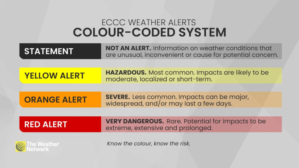
As of late 2025, several national agencies, including Environment and Climate Change Canada (ECCC), transitioned to a unified, impact-based colour-coded system. This move aligns with international standards recommended by the World Meteorological Organization (WMO).
1. The Alert Colour Scale
In Canada and many other countries (like the UK and Ireland), alerts for watches, warnings, and advisories now use three primary colours to indicate risk levels:
| Colour | Risk Level | Meaning & Action |
| Yellow | Moderate | Hazardous weather is possible. It may cause localized disruption or damage (e.g., broken branches, minor delays). Action: Monitor forecasts and plan ahead. |
| Orange | High | Severe weather is likely. Significant damage, widespread power outages, or travel disruptions are expected. Action: Take action to protect yourself and your property. |
| Red | Extreme | Very dangerous, life-threatening weather is imminent. Extreme damage and prolonged, widespread disruption will occur. Action: Follow safety instructions and avoid travel. |
Note: “Special Weather Statements” or “Metnotes” typically remain Grey/White as they provide information about non-hazardous but significant weather events.
2. Radar Reflectivity Colours
On a weather radar map, colour codes indicate the intensity of precipitation (rain, snow, or hail) by measuring the “reflectivity” ($dBZ$) of particles in the air.
- Light Green: Very light rain or drizzle (sometimes evaporating before it hits the ground).
- Dark Green: Light to moderate rain.
- Yellow/Orange: Moderate to heavy rain. In winter, this can indicate “bright banding” where snow is melting into rain.
- Red/Magenta: Intense rain or large hail.
- Blue/White: Typically represents snow, with darker blues indicating heavier snowfall rates.
- Pink: Often used to show a mix of precipitation, such as freezing rain or sleet.
3. Surface Map Symbols
Weather maps also use consistent colour coding for technical features like pressure systems and fronts:
- Red: Warm fronts and Low Pressure centers (L).
- Blue: Cold fronts and High Pressure centers (H).
- Purple: Occluded fronts (where a cold front has overtaken a warm front).
- Orange/Dashed: Troughs (elongated areas of low pressure).
4. How the Colour is Chosen
Forecasters use a “Risk Matrix” to decide the colour of an alert. It isn’t just about how “bad” the wind or snow is, but rather a combination of two factors:
- Confidence: How sure are the meteorologists that the event will happen?
- Impact: How much will this affect people? (e.g., 10 cm of snow in Vancouver gets a higher colour code than 10 cm of snow in Calgary because the impact on the local infrastructure is much greater).
Would you like to see the current colour-coded alert map for Alberta to see if there are any active yellow or orange warnings today?
Weather warnings in Canada: How the colour coding works
This video provides a clear breakdown of how modern colour-coded systems categorize weather risks based on potential impact and likelihood.
What is the relationship between forecast skill and accuracy?
In meteorology, accuracy and skill are often used interchangeably in casual conversation, but they have distinct technical meanings. The relationship between them is essentially a comparison between raw performance and “earned” performance.
1. Accuracy: The “Raw” Score
Accuracy is the degree to which a forecast matches the actual observed weather. It is a direct measurement of error.
- Metric: Usually measured by Mean Absolute Error (MAE) or Root Mean Square Error (RMSE).
- The Problem with Accuracy: A forecast can be highly “accurate” without being “good.”
- Example: If you live in a desert and forecast “no rain” every single day for a year, your accuracy will be near 100%. However, you haven’t demonstrated any meteorological knowledge—you’ve just exploited a stable climate.
2. Skill: The “Value-Add” Score
Skill is a measure of how much better a forecast is compared to a simple, “no-effort” baseline. It represents the “smarts” or the “added value” of the forecaster or model.
- Baselines: Skill is typically measured against two benchmarks:
- Climatology: The long-term historical average for that date.
- Persistence: Assuming tomorrow will be exactly like today.
- Skill Score Formula: A standard skill score is calculated as:
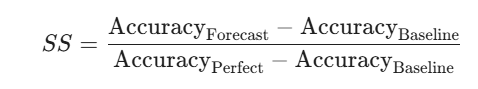
3. The Core Relationship
The relationship can be summarized as: Skill is Relative Accuracy.
| Scenario | Accuracy | Skill | Why? |
| Forecasting “Sunny” in the Sahara | High | Low/Zero | It’s easy to be right; you didn’t beat the baseline. |
| Forecasting a Tornado 20 mins early | Low (Exact path error) | Very High | Beating the “no-tornado” baseline is extremely difficult and requires expertise. |
| Long-range (Day 15) Forecast | Moderate | Zero | Usually, by day 15, a computer model is no more accurate than just using the historical average (Climatology). |
4. Why This Matters to Forecasters
- The Skill Horizon: Meteorologists look for the point where a model’s “skill score” drops to zero. This is the predictability limit. Beyond this point, the model is providing no more information than a 30-year average would.
- Difficulty Calibration: Skill accounts for the “difficulty” of the weather. It is much more “skillful” to accurately predict a 5°C temperature drop during a chaotic cold front than it is to predict a steady 25°C during a stagnant high-pressure ridge.
- Continuous Improvement: By focusing on skill rather than just accuracy, weather agencies can track if their expensive new supercomputers are actually providing new value, or if they are just getting lucky with a quiet weather year.
What is the relationship between weather prediction and the marketplace?
The relationship between weather prediction and the marketplace is a multi-billion dollar intersection where atmospheric data is treated as a primary economic driver. In 2026, the global weather forecasting services market is valued at approximately $2.95 billion, reflecting how deeply businesses now rely on “weather intelligence” to manage risk and protect profit margins.
1. Weather as a “Primary Force” in Commodities
In the financial sector, weather is no longer a background variable; it is often the lead signal for price formation.
- Soft Commodities: Prices for coffee, sugar, and soy are currently seeing high volatility in 2026 due to uneven rainfall in Brazil and dryness in Argentina. Traders often react to “weather headlines” before official crop reports are even released.
- Energy Markets: Accurate forecasts are the cornerstone of energy pricing. Cold snaps drive immediate spikes in natural gas, while heatwaves surge electricity demand for cooling.
- The “Invisible Force”: Modern financial models are increasingly struggling to handle “physical variables” like soil moisture and wind patterns, which are now moving markets faster than traditional economic data (like interest rate shifts).
2. The Weather Derivatives Market
Because weather can cause actual economic losses (e.g., a ski resort losing money during a warm winter), the marketplace has created Weather Derivatives.
- Parametric Insurance: Instead of waiting for an adjuster to inspect damage, these contracts pay out automatically if a specific weather “index” is met (e.g., if the temperature stays above $30^\circ\text{C}$ for five consecutive days).
- Predictive Power: Research has shown that the price of certain futures (like orange juice) can actually be a better predictor of weather anomalies than meteorological models alone, as the “collective wisdom” of the market aggressively prices in every possible atmospheric hint.
3. Industry-Specific Impacts (2026 Trends)
| Sector | Marketplace Relationship | 2026 Context |
| Energy | Grid Stability & Renewables | High demand for “nowcasts” to balance solar/wind output with data center surges. |
| Retail/Fashion | Inventory Management | Retailers use seasonal forecasts to decide when to stock winter coats vs. spring wear. |
| Insurance | Risk Pricing | A shift toward “Impact-Based Analytics” to quantify the ripple effects of storms on local infrastructure. |
| Logistics | Supply Chain Efficiency | AI-driven weather routing for shipping is reducing fuel costs by avoiding high-sea “drag” and storms. |
4. The Value of the “24-Hour Notice”
According to the WMO, investing in multi-hazard early warning systems can reduce disaster damage by up to 30% with just 24 hours of notice. This “prevented loss” represents a massive portion of the value within the marketplace, particularly for large enterprises that account for nearly 68% of the weather services market share this year.
5. Emerging Trends: AI and “Nature as Infrastructure”
- Conversational AI: In 2026, AI assistants are being deployed to design custom insurance coverage and educate local businesses on climate risk.
- Economic Resilience: Richer, more diverse economies are proving more resilient to weather shocks, while developing nations are facing higher inflationary pressures due to rising energy costs for cooling.
How are forecasts made with surface charts?
Using a surface chart (also known as a synoptic scale chart) is the most traditional “boots-on-the-ground” method for forecasting. It allows a meteorologist to see how weather systems are interacting with the Earth’s terrain and where the most immediate changes will occur.
Forecasting with these charts involves a process of identification, extrapolation, and interpretation.
1. Identifying the “Players”
The first step is to locate the primary features that drive weather.
- High-Pressure Centers (H): Usually associated with sinking air, clear skies, and light winds.
- Low-Pressure Centers (L): Associated with rising air, clouds, and precipitation.
- Isobars: These lines of constant pressure tell you about the wind. The closer the lines are together (a “tight pressure gradient”), the stronger the winds will be.
- Frontal Boundaries: These are the “battle lines” between air masses:
- Cold Front (Blue spikes): Often brings a sharp drop in temperature and brief, heavy rain or storms.
- Warm Front (Red semicircles): Brings gradual warming and steady, prolonged precipitation.
- Stationary Front (Alternating): Weather that “stalls” for days.
2. The Method of Extrapolation (Trending)
Once the features are identified, a forecaster calculates where they are going.
- Movement: A forecaster looks at the movement of a Low-pressure center over the last 6 to 12 hours. If it moved 300 km east in 6 hours, a “trend” forecast assumes it will move another 300 km east in the next 6 hours.
- Steering: Forecasters look at the orientation of the isobars. Low-pressure systems tend to move parallel to the isobars in the “warm sector” (the area between the warm and cold fronts).
3. Cross-Referencing with Pressure Tendency
Surface charts often include isallobars (lines of pressure change) or station plots showing the “pressure tendency” (whether the barometer is rising or falling).
- Falling Pressure: Usually indicates an approaching storm ($L$) or front.
- Rising Pressure: Indicates the storm is moving away and fair weather ($H$) is arriving.
- Rule of Thumb: A Low-pressure system will generally move toward the region where pressure is falling most rapidly.
4. Analyzing Station Models
Each “dot” on a surface chart is a station model—a highly condensed block of data for a specific city. By looking at these, a forecaster can see local details that a computer model might miss:
- Temperature/Dew Point Spread: If the temperature and dew point are close together, fog or rain is imminent.
- Wind Shifts: If stations to your west show wind shifting from South to Northwest, a cold front has likely passed them and is headed toward you.
5. Short-Term Forecast Rules
| Observation | Forecast |
| Isobars “kinking” across a front | Indicates the front is strong and wind will shift abruptly upon passage. |
| Pressure falling rapidly (>1 hPa/hr) | A strong storm is approaching; expect increasing winds and precipitation. |
| Winds blowing across isobars toward Low | Friction near the surface is causing air to converge and rise, leading to cloud formation. |
Limitations
Surface charts are excellent for the next 6 to 24 hours, but they are “2D.” They don’t show what is happening high in the atmosphere. To see if a storm will actually “explode” in intensity, a forecaster must compare the surface chart to the upper-air maps (like the 500 hPa map) to see if the jet stream is providing support.
How are weather systems movement determined?
The movement of weather systems is not random; it is a predictable response to the physics of our rotating planet. Meteorologists determine where a storm is going by looking at three main levels of “steering”: the global flow, the upper-air “engine,” and surface trends.
1. The Global “Conveyor Belt” (Westerlies)
On a planetary scale, the movement is dictated by the Earth’s rotation and the Coriolis Effect.
- The Mid-Latitudes: In regions like North America and Europe, weather systems almost always move from west to east. This is because we live in the “Westerlies” zone.
- The Deflection: Because the Earth spins faster at the equator than at the poles, air moving north in the Northern Hemisphere is deflected to the right. This creates a consistent eastward push for large-scale Highs and Lows.
2. The 500 hPa “Steering Level”
If you want to know where a storm will be tomorrow, you don’t look at the ground; you look about 5.5 km (18,000 ft) up into the atmosphere. This is the 500 hPa pressure level.
- The Steering Current: Winds at this middle level of the atmosphere act like a river, carrying smaller weather “eddies” (storms) along with them.
- Troughs and Ridges: * Troughs (U-shape): Storms typically follow the “exit” side of a trough, moving from the southwest toward the northeast.
- Ridges (n-shape): These act as blocks, forcing storms to steer around them, often pushing weather toward the southeast.
3. Dynamic Steering (Vorticity)
Meteorologists also calculate Vorticity—the “spin” of the air.
- Positive Vorticity Advection (PVA): When areas of high spin (found in troughs) move into a new region, they act like a vacuum, sucking air up from the surface. This causes a surface Low-pressure system to move toward that region of “lift.”
- Height Tendency: By watching where the atmospheric “heights” are falling on a map, forecasters can see where the center of a storm is being pulled.
4. Forecasting Methods for Movement
| Method | How it Works | Best For… |
| Extrapolation (Trend) | Measuring a storm’s speed over the last 6 hours and project it forward. | Short-term “nowcasts” (0–6 hours). |
| Steering Flow | Following the direction of the 500 hPa winds. | 12–48 hour storm tracking. |
| Numerical Models | Using supercomputers to solve fluid dynamics equations. | Long-range (3–10 day) movement. |
| Ensembles | Running a model 50 times to see the range of possible paths. | Measuring uncertainty in a hurricane or blizzard track. |
5. Local Obstacles (Topography)
Finally, the “terrain” can alter a system’s path.
- Mountain Blocking: Large ranges like the Rockies can “stall” a system on the windward side or cause a “Lee Cyclone” to form on the eastern side (common in Alberta).
- Friction: Over land, friction slows the wind down and causes air to spiral inward toward Lows more aggressively than it does over the smooth surface of the ocean.
A forecasting case study for Hamilton and Sault Ste. Marie.
The forecasting case study comparing Hamilton and Sault Ste. Marie is a classic exercise in Canadian meteorology used to demonstrate how geography, water bodies, and elevation dramatically alter the accuracy and “skill” of a forecast, even when using the same numerical models.
While both are Ontario cities, they represent two very different forecasting challenges.
1. Hamilton: The “Escarpment & Lake” Challenge
Hamilton is notorious among forecasters because it contains three distinct microclimates within a single city.
- The Niagara Escarpment (The “Mountain”): The 100-meter elevation rise between the lower city and the “Mountain” often creates a rain-snow line right in the middle of residential areas. It can be raining downtown while a blizzard is occurring at the Hamilton Airport (which is on the Mountain).
- Lake Ontario (The “Lake Effect”): In the spring and summer, the cold lake water creates a powerful “lake breeze” that can keep the lower city 10°C cooler than the Mountain.
- The Problem: Most automated forecasts use the Hamilton Airport (YHM) as the primary data point. This results in a “forecast bust” for residents in the lower city, who see a temperature or precipitation type that doesn’t match their reality.
2. Sault Ste. Marie: The “Converging Lakes” Challenge
Sault Ste. Marie (“The Soo”) sits at the junction of Lake Superior and Lake Huron, creating a completely different set of problems.
- Superior’s Depth: Lake Superior is so deep and vast that it rarely freezes completely. This provides a constant source of moisture and heat throughout the winter, leading to massive lake-effect snow events that are difficult to pin down to a specific neighborhood.
- The Convergence Zone: Forecasters must track how winds from two different lakes interact. A shift of just 10 degrees in wind direction can move a heavy snow band from the city center to the uninhabited bush north of town.
- The Problem: Because the area is less densely populated than the Golden Horseshoe (Hamilton), there are fewer ground-based weather stations. This creates “data gaps” that make it harder for numerical models to initialize accurately.
3. Comparison of Forecasting Problems
| Feature | Hamilton Problem | Sault Ste. Marie Problem |
| Primary Driver | Elevation (The Escarpment) | Interaction of two Great Lakes |
| Temperature | High variance ($10^\circ\text{C}$+) across city | Buffered by the massive heat of Lake Superior |
| Precipitation | Rain vs. Snow transition (540-dam line) | Intense, localized lake-effect snow bands |
| Model Accuracy | Models struggle with 100m elevation jumps | Models struggle with the “convergence” of lake winds |
4. How Forecasters Solve It
To solve the problems presented in this case study, meteorologists use specific tools:
- In Hamilton: They rely heavily on High-Resolution Models (HRRR) that can “see” the Escarpment, and they often issue “split” forecasts (e.g., “High 5 near the lake, 10 on the mountain”).
- In Sault Ste. Marie: They use Dual-Pol Radar to distinguish between lake-effect snow (which has small, needle-like flakes) and synoptic snow (larger flakes), allowing them to predict accumulation rates more accurately.
A Forecasting Example
A classic and highly relevant forecasting example for someone in Calgary is the “Chinook” Event. This provides a perfect case study of how a “forecast funnel” approach is used to predict a dramatic, localized weather shift that models often struggle to pin down.
The Setup: The “Lee Trough”
A Chinook isn’t just a warm wind; it is a complex interaction between the Pacific jet stream and the physical barrier of the Canadian Rockies.
- Hemispheric Scale: Forecasters look for a strong, “zonal” (west-to-east) flow of the jet stream coming off the Pacific Ocean.
- Synoptic Scale: As this moist Pacific air hits the mountains, it is forced upward (orographic lift), dropping its moisture on the British Columbia side. On the Alberta side (the “lee” side), a Lee Trough forms—a long area of low pressure that pulls air down the eastern slopes.
- The Physics: As the air descends, it compresses. Because atmospheric pressure is higher at the surface than at the mountain peaks, this compression heats the air rapidly at the Dry Adiabatic Lapse Rate (roughly $10^\circ\text{C}$ for every 1,000 meters of descent).
The Forecasting Problem: The “Cold Pool”
The biggest challenge for a Calgary forecaster during a Chinook is the Inversion.
- The Problem: Often, a shallow “pool” of arctic air (-20°C) is sitting stubborn and heavy right at the surface in the city. The warm Chinook air (+10°C) is blowing just 100 meters above the ground, but it’s too light to “kick out” the heavy cold air.
- The Result: A computer model might predict a high of +8°C, but if the wind doesn’t reach the surface, the actual temperature stays at -18°C. This is a massive “forecast bust.”
How Forecasters Solve It
To avoid this error, meteorologists use specific diagnostic tools:
- The “Chinook Arch”: Forecasters look at satellite imagery for a very specific cloud pattern—a sharp, straight line of high-altitude clouds parallel to the mountains. This “arch” indicates the exact boundary where the warm air is rising back up after its initial descent.
- Pressure Gradients: They measure the pressure difference between Revelstoke, BC and Calgary, AB. If the pressure in BC is significantly higher than in Calgary, the “push” is likely strong enough to break the surface inversion.
- Vertical Soundings (Skew-T): They look at weather balloon data to see exactly how thick that cold surface layer is. If it’s only 50 meters thick, a 40 km/h wind will easily mix the warm air down. If it’s 300 meters thick, the city will stay in the deep freeze.
Comparison: Successful vs. Failed Chinook Forecast
| Feature | Successful Chinook | “Busted” Chinook |
| Wind Speed | Gusts >60 km/h (mixes air down) | Light winds <20 km/h |
| Sky | Clear blue “slot” near mountains | Overcast/Foggy near surface |
| Dew Point | Drops significantly (very dry air) | Remains high (moisture trapped) |
| Temperature | Jumps 20°C in one hour | Stays steady at sub-zero |
Why This Matters to the Marketplace
In Calgary, a Chinook forecast is high-stakes.
- Energy: Utility companies need to know if they can suddenly scale back natural gas production as heating demand drops.
- Infrastructure: Sudden melting followed by a “flash freeze” when the Chinook ends creates massive road safety hazards and ice-damming on roofs.
What is the 500 hPa chart?
If the surface chart tells you what is happening now, the 500 hPa chart tells you what is going to happen next.
Often called the “steering level” map, it represents the atmosphere at approximately 5,500 meters (18,000 feet) above sea level. This is the midway point of the atmosphere by mass—exactly half of the air is above this level, and half is below.
1. It’s Not About Pressure, It’s About Height
Unlike a surface map where you look for changes in pressure at a constant height (sea level), the 500 hPa chart is a constant pressure chart. The pressure is the same everywhere on the map (500 hPa). What changes is the altitude (Geopotential Height) at which that pressure is found.
- High Heights (Ridges): Indicated by “bulges” toward the poles. This represents warm, less-dense air that occupies more space. Ridges usually bring fair, dry weather.
- Low Heights (Troughs): Indicated by “dips” toward the equator. This represents cold, dense air. Troughs are the “engine” for storms, providing the lift needed for rain and snow.
2. The “Steering” Principle
Weather systems (Highs and Lows) at the surface are pushed along by the winds at the 500 hPa level.
- Rule of Thumb: A surface storm will move at about 50% of the speed of the 500 hPa wind and in the same general direction.
- If the 500 hPa winds are blowing straight from west to east (zonal flow), weather will move quickly and change often. If the winds are wavy (meridional flow), systems can get “stuck,” leading to prolonged heatwaves or rainy spells.
3. Key Features to Look For
When meteorologists open a 500 hPa chart, they are hunting for three specific things:
- Vorticity (The “Spin”): This is often shown as colorful shading (usually red/orange). Areas of “Positive Vorticity Advection” (PVA) indicate where air is spinning and being forced upward. This is a massive “red flag” for developing storms at the surface.
- Shortwaves: These are small “kinks” or ripples within the larger troughs. While the large trough dictates the week’s weather, a shortwave is often the specific “trigger” that starts a thunderstorm or a blizzard.
- 540 dam Line: This is the height contour for 5,400 meters. In the winter, this line is the “magic boundary”—if you are north of this line, precipitation is likely to be snow; south of it, it’s likely rain.
4. Comparison: Surface vs. 500 hPa
| Feature | Surface Chart | 500 hPa Chart |
| Lines represent… | Isobars (Constant Pressure) | Isohypses (Constant Height) |
| Primary Goal | Current conditions (Temp/Rain) | Future movement and storm “energy” |
| Key Symbols | H, L, Fronts | Ridges, Troughs, Vorticity |
| Human Impact | What you feel when you step outside | Why the weather is changing |
Why this matters for Calgary
Because Calgary is at a high elevation (~1,045 m), we are “closer” to the 500 hPa level than coastal cities. This makes us more sensitive to the upper-air flow. When a trough digs into the Pacific Northwest, it often triggers the “Lee Troughing” effect on the east side of the Rockies, which can lead to those rapid weather shifts we experience.
What is a computer prognosis?
A computer prognosis (often shortened to a prog) is a weather map or chart that shows the predicted future state of the atmosphere.
While a diagnostic chart (like a Surface Analysis) shows what is happening right now, a prognostic chart shows what the computer model thinks the weather will look like at a specific time in the future (e.g., 12, 24, or 48 hours from now).
1. Prognosis vs. Analysis
The easiest way to understand a computer prognosis is to compare it to its counterpart:
- Analysis Chart: A “snapshot” of the past or present. It is created using real data from weather stations, balloons, and satellites.
- Prognostic Chart (Prog): A “vision” of the future. It is generated by a supercomputer running Numerical Weather Prediction (NWP) models. It doesn’t contain real observations; it contains “machine-made” calculations of where fronts and pressure systems will move.
2. How a “Prog” is Created
The computer doesn’t just “guess” the map; it builds it using a step-by-step mathematical process:
- The Initial State: The computer starts with the current analysis (the “starting line”).
- Time-Stepping: It uses the laws of physics to calculate how the air will move over the next 5 or 10 minutes.
- Iteration: It takes that 10-minute result and uses it as the new starting point to calculate the next 10 minutes.
- Final Output: It repeats this millions of times until it reaches the target time (e.g., 24 hours). It then “draws” the final predicted isobars, fronts, and precipitation areas on a map.
3. Types of Prognostic Charts
Forecasters use different “progs” depending on what they are trying to predict:
- Surface Progs: Show predicted surface pressure (H and L centers), fronts, and precipitation types (rain/snow).
- Upper-Air Progs: Show the predicted heights of pressure surfaces (like the 500 hPa chart) to see how the jet stream will shift.
- Significant Weather Progs: Used extensively in aviation to show predicted areas of turbulence, icing, and cloud ceilings.
- Quantitative Precipitation Forecast (QPF): A specific prognosis showing exactly how many millimeters of rain or centimeters of snow are expected to fall in a given area.
4. Why “Progs” Can Be Wrong
Since a prognosis is entirely mathematical, it is only as good as the data it starts with.
- Initialization Errors: If a weather station in the Pacific is broken and reports the wrong pressure, the “starting line” is wrong, and the 24-hour prognosis will be “off.”
- Parameterization: Small events (like a single thunderstorm) are too small for the computer’s grid to see, so it has to “estimate” their impact. Over time, these small estimates can lead to large errors in the final map.
| Feature | Surface Analysis (Diagnostic) | Computer Prognosis (Predictive) |
| Data Source | Real-world observations | Mathematical model calculations |
| Timeframe | Current or Recent Past | 12 to 240+ hours into the future |
| Common Use | Identifying current hazards | Planning and future-casting |
| Nickname | “The Analysis” | “The Prog” |
Since you’ve been looking into how weather models work, would you like to see a current 24-hour prognostic chart for North America to see where the computer thinks the next cold front will be tomorrow?
How computers create weather forecasts
This video explains the transition from collecting real-world observations to how supercomputers solve mathematical equations to generate the final prognostic charts used by forecasters.
What does it mean to say when a forecast is valid for?
In meteorology, the “Valid Time” is the specific moment or period for which the forecast’s predicted conditions are expected to occur. It is the “snapshot” in time that the computer model or forecaster is aiming for.
There is a critical distinction between the Issuance Time (when the forecast was typed and sent) and the Valid Time (when the weather is actually supposed to happen).
1. Valid Time as a “Snapshot” (Prog Charts)
On professional weather maps, such as surface prognosis (prog) charts, you will often see a single time listed (e.g., “Valid 1200Z Tuesday”).
- Meaning: This map is a prediction of what the atmosphere will look like at exactly that second.
- The “Lag”: Because it takes supercomputers time to crunch numbers and for humans to review them, a “Current Analysis” map’s valid time is often 90 minutes in the past by the time you see it. It is a “snapshot” of the most recent confirmed data.
2. Valid Period (TAFs and Public Forecasts)
In aviation (TAFs) and some public forecasts, you will see a Valid Period (e.g., “Valid 2412/2518”).
- Meaning: This indicates a range of time.
- Format: The first two digits are the day of the month, and the last two are the hour in UTC (Zulu). For example,
2412/2518means the forecast is valid from 12:00 PM on the 24th until 6:00 PM on the 25th. - Superseding: Even if a forecast is “valid” for 24 hours, if a new one is issued (like a “TAF AMD” for an amendment), the old one is no longer valid, even if its time window hasn’t expired yet.
3. Valid Time vs. “For Use” Time
This is a nuance often used in aviation and specialized logistics:
- Valid Time: The meteorological “target” time.
- For Use Time: The window during which a human should actually rely on that piece of paper. For example, a “Winds Aloft” forecast might be valid for 12:00Z, but it is intended for use between 09:00Z and 15:00Z.
| Term | Question it Answers | Example |
| Issuance Time | When was this written? | 09:45 AM |
| Valid Time | When is this weather happening? | 12:00 PM |
| Valid Period | What is the start and end of this window? | Monday 12:00 PM to Tuesday 06:00 PM |
4. Why it Matters for Accuracy
The further you get from the Issuance Time toward the end of the Valid Period, the less “skillful” the forecast becomes.
- A forecast valid for “6 hours from now” is typically highly accurate.
- A forecast valid for “120 hours (5 days) from now” is a mathematical estimate that is much more likely to be adjusted as the valid time approaches.
How is ai and iPhones changing the way forecasting is done?
The landscape of weather forecasting in 2026 is currently undergoing its most radical shift since the invention of the supercomputer. We are moving from a world of “Physics-First” (calculating every atom’s movement) to a world of “Data-First” (recognizing patterns from history).
Here is how AI and the smartphone in your pocket are fundamentally rewriting the rules.
1. AI: The Shift from Equations to Patterns
For 50 years, forecasting relied on Numerical Weather Prediction (NWP)—solving massive fluid dynamics equations. Today, AI models like Google’s GraphCast, Huawei’s Pangu-Weather, and NVIDIA’s FourCastNet have flipped the script.
- Speed over Supercomputing: A traditional global forecast takes hours on a building-sized supercomputer. AI can generate a 10-day global forecast in less than one minute on a single high-end GPU.
- Historical Intuition: Instead of asking “What do the laws of physics say happens next?”, AI asks “Given the last 40 years of data, what usually happens after a setup like this?”
- Energy Efficiency: Operating an AI model for a year is estimated to consume 21 times less energy than traditional supercomputing, significantly reducing the carbon footprint of meteorology.
2. The iPhone as a “Mobile Weather Station”
Your iPhone isn’t just a screen for viewing the weather; it has become a critical sensor for making the forecast.
- Pressure Sensors (Barometers): Modern iPhones contain high-precision barometers used for altitude tracking. NOAA and other agencies now tap into millions of these anonymized data points to fill “data gaps” in cities. This helps identify the exact moment a pressure front passes through a neighborhood.
- Crowdsourced Ground Truth: When you report “It’s hailing” in an app, that data is instantly fed into “nowcasting” algorithms to verify radar signatures.
- Ambient Sensors: Researchers are exploring how smartphone light sensors and battery temperature can provide clues about solar radiation and urban “heat islands” in real-time.
3. “Nowcasting” and the 30-Second Advantage
The combination of AI and mobile edge computing has created a new frontier called Nowcasting (0–2 hour forecasts).
- Sub-Minute Refresh: New AI-enhanced radar processing can detect a tornado signature or a microburst up to 30 seconds faster than traditional systems. In meteorology, 30 seconds is the difference between a warning reaching a stadium and a disaster.
- Hyper-Local Precision: Because AI is excellent at “downscaling,” it can take a broad 25 km model and predict exactly which street corner in Calgary will see the first raindrop.
Summary: 2026 Forecasting Evolution
| Feature | Traditional Method (NWP) | AI & Mobile Era (2026) |
| Foundation | Physics & Calculus | Pattern Recognition & Big Data |
| Hardware | $100M+ Supercomputers | High-end GPUs & Edge Devices |
| Data Input | Balloons & Satellites | Balloons, Satellites, & Millions of Phones |
| Forecast Time | 3–6 Hours | < 1 Minute |
| Best For… | Long-range global trends | Local, rapid, high-impact events |
The “Black Box” Limitation
While AI is faster and often more accurate, it has a major hurdle: Explainability. A traditional model can show you exactly why a storm formed (e.g., “warm air was lifted over a cold front”). An AI might give you the right answer but can’t yet explain the “physics” behind its choice. This is why 2026 is the year of the Hybrid Model, where AI does the heavy lifting and humans/physics models provide the “sanity check.”
Since you’re interested in how these tools are evolving, would you like me to look up the latest AI-driven forecast for the Calgary region to see how it compares to the traditional Environment Canada output?
AI and the Future of Weather Forecasting
This video features experts from the World Meteorological Organization (WMO) explaining how machine learning is being integrated into global operational systems to create faster, more accessible forecasts.
Solved Problems
As an IT specialist with a background in meteorology, you’ll recognize that the most challenging problems in the field arise where raw physics meets operational constraints.
Here are 15 high-level application problems, the underlying “Thinking Process” experts use to frame them, and the technical solutions employed in 2026.
1. The Small-Scale Storm “Grid” Problem
- Problem: Traditional models use grid boxes (e.g., 10 km) that are too large to “see” individual thunderstorms or tornadoes.
- Thinking Process: Recognize that the atmosphere is a “multiscale” fluid. If the model can’t resolve the feature, it must estimate its effect on the larger grid.
- Solution: Parameterization. Forecasters use sub-grid mathematical schemes to represent the cumulative heat and moisture release of thousands of un-modeled small clouds.
2. The “Butterfly Effect” in Initial Conditions
- Problem: Tiny errors in current temperature or pressure readings grow exponentially, making long-range forecasts “garbage.”
- Thinking Process: Accept that the atmosphere is a chaotic system where a single “truth” is impossible to capture.
- Solution: Ensemble Forecasting. Run the same model 50 times with slightly different starting data. If most runs agree, confidence is high; if they scatter, the forecast is uncertain.
3. Urban Heat Island (UHI) Accuracy
- Problem: Cities are significantly warmer than surrounding rural areas, but models often treat the land surface as uniform.
- Thinking Process: View the city not as “land,” but as a complex 3D structure of concrete, glass, and waste heat.
- Solution: Urban Canopy Models (UCMs). Integrate specific “city-physics” into the model, accounting for street widths, building heights, and the high thermal mass of asphalt.
4. The Rain-Snow Transition “Guessing Game”
- Problem: A 0.5°C difference determines if a city gets slush or a paralyzing blizzard.
- Thinking Process: Shift focus from surface temperature to the vertical temperature profile (the “melting layer”).
- Solution: Partial Thickness Analysis & Dual-Pol Radar. Use 1000–850 hPa thickness charts to find the “magic” 540 dam line, and use dual-polarization radar to identify “bright banding” where snow is actively melting.
5. Predicting Forest Fire Smoke Dispersion
- Problem: Smoke plumes don’t just drift; they interact with local winds and create their own microclimates.
- Thinking Process: Treat smoke as both a pollutant and a “radiative shield” that blocks sunlight and changes surface heating.
- Solution: Coupled Fire-Atmosphere Models. Systems like BlueSky Canada link fire behavior models directly with weather models to predict plume rise and downstream air quality.
6. Aviation Turbulence in “Clear Air”
- Problem: Turbulence can occur in perfectly clear skies without any clouds to warn pilots on radar.
- Thinking Process: Look for “Vertical Wind Shear”—areas where wind speed or direction changes rapidly over a short vertical distance.
- Solution: Ellrod Indices. Mathematical algorithms that calculate the deformation and convergence of the jet stream to highlight “invisible” zones of high kinetic energy.
7. The “Data Void” over Oceans
- Problem: Most weather starts over oceans where there are no ground stations, leaving models “blind” to incoming systems.
- Thinking Process: Shift from “In-Situ” (on-site) sensors to Remote Sensing from above.
- Solution: Satellite Radiance Data. Using infrared and microwave sensors on satellites to “sound” the atmosphere’s temperature and moisture levels from space.
8. Improving “Nowcasting” for Flash Floods
- Problem: Flash floods happen faster than a standard 3-hour model update cycle can handle.
- Thinking Process: Transition from “predicting” to “extrapolating” based on real-time movement.
- Solution: Radar Echo Tracking (TREC). Use AI to track the movement of heavy rain cells in 5-minute increments, projecting their path directly over vulnerable watersheds.
9. Marine “Sea State” and Ship Routing
- Problem: Wind speed alone doesn’t tell a ship captain the danger; they need to know wave height, period, and “rogue wave” potential.
- Thinking Process: Treat the ocean surface as a “response” to the atmospheric “input.”
- Solution: WaveWatch III (WW3) Coupling. Link weather models to spectral wave models that calculate how energy transfers from the wind into the water surface over thousands of miles.
10. The “Spin-Up” Problem in NWP
- Problem: When a computer model starts, it often takes several “hours” of simulation time before the clouds and rain look realistic.
- Thinking Process: Recognize that the initial “math” doesn’t have the moisture in balance with the wind yet.
- Solution: Hot-Starting (Data Assimilation). Use techniques like 4D-Var to “nudge” the model so the initial state is already in physical balance.
11. Identifying “Dryline” Severe Weather Triggers
- Problem: In the Prairies/Plains, a sharp boundary between moist and dry air (the dryline) can sit still for hours and then suddenly explode into tornadoes.
- Thinking Process: Monitor the Convergence—where winds from the east and west collide, forcing air upward.
- Solution: High-Resolution Mesoscale Models (HRRR). Use 3 km grid resolution to see the “tight” moisture gradients that 10 km global models miss entirely.
12. Energy Grid Load Forecasting
- Problem: Utilities need to know the exact temperature to prevent blackouts, but “average” city forecasts are too vague.
- Thinking Process: Connect weather variables directly to human behavior (e.g., “At what temperature do 1 million people turn on their AC?”).
- Solution: Model Output Statistics (MOS). Apply statistical corrections to raw model data based on 20 years of local historical errors to give a “site-specific” temperature.
13. Volcanic Ash and Engine Safety
- Problem: Ash clouds look like regular clouds on some satellite imagery but can destroy jet engines.
- Thinking Process: Use the “Split Window” technique—comparing different infrared wavelengths to see the “signature” of silicate (ash) vs. water vapor.
- Solution: HYSPLIT Dispersion Models. Run trajectory models that specifically account for the weight and “fall speed” of different-sized ash particles.
14. Predicting “Chinook” Surface Breakthroughs
- Problem: Warm air sits above a cold pool in Calgary, but will the wind be strong enough to “kick out” the cold?
- Thinking Process: Analyze the Static Stability. If the cold air is too deep or heavy, the warm wind will simply “skip” over the city.
- Solution: Isallobaric Analysis. Watch for rapid pressure drops to the east of the Rockies; a strong enough “pull” will eventually drag the warm air down to the surface.
15. Managing AI “Hallucinations” in Forecasting
- Problem: AI models are fast, but they don’t “know” physics; they might predict a storm that is physically impossible.
- Thinking Process: Use AI for speed and pattern recognition, but keep the physics-based NWP as the “Guardrail.”
- Solution: Physics-Informed Neural Networks (PINNs). Train AI models using the actual equations of fluid dynamics so they cannot “hallucinate” results that violate the laws of thermodynamics.